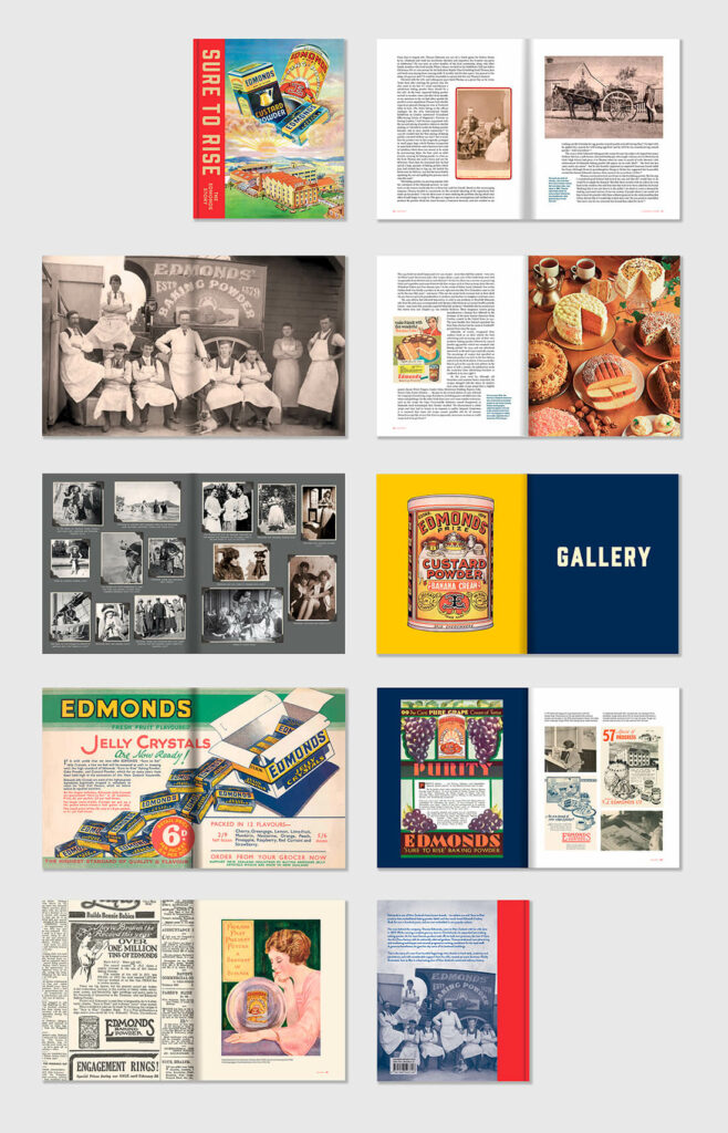
Oh boy, this book was a biggie! Close to four years in the making, various points of contact, hundreds of images and the weight of responsibility with working on one of the county’s most loved brands.
Sure to Rise: The Edmonds Story tells of the famous baking powder, patents, trademarks, the hugely popular cookbook, renowned factory and gardens, the family behind the brand, and the landmarks founder Thomas Edmonds gifted to Ōtautahi Christchurch.
Authored by Peter Alsop, Kate Parsonson and Richard Wolfe, the book uses more than 500 images to help document the Edmonds family story alongside the evolution of one of Aotearoa New Zealand’s most distinctive brands and its domestic trademark – the Edmonds Sure to Rise logo. Done and dusted, and available from (most) good book shops.
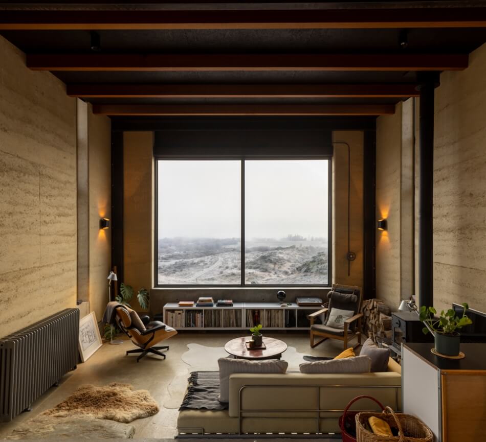
This project is one that is very close to home. In fact, it IS home. When we moved to Central Otago in 2019, we commissioned a simple house by Christchurch architect and sometime collaborator Charlie Nott. It’s still a work in progress, but we were stoked to win a few awards in 2023, an NZIA Southern Architecture Award, an NZIA National Award, the NZ Interior Design Award for a residential building and a Best Design Award. Good things come in small packages.
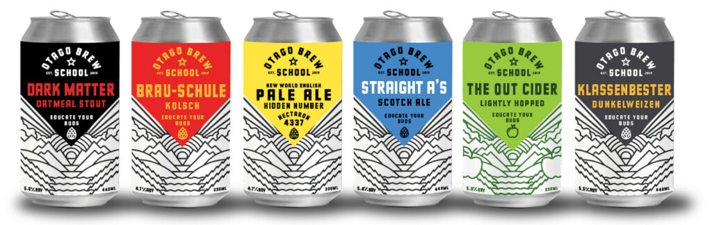
The Otago Brew School is a full time brewery course run by Otago Polytechnic / TePukenga from their Bannockburn, Central Otago / Comwell Campus. The by-product of teaching brewers is they make a lot of beer – in various styles. So they created a retail arm and Gas were tasked with naming, branding and package design. The can design is based on the location in Bannockburn, near Lake Dunstan – an environment surrounded by mountains and dramatic skies. The site is not only a brewery, it is the future of brewing in Aotearoa, by offering hands-on learning to help craft the next generation of brewers. We’ll drink to that.
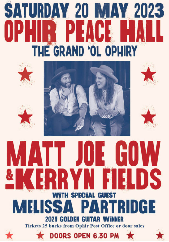
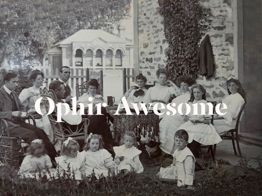
Part of living in a small community is that if you want something to happen, you pretty much have to do it yourself. So a group of us in Ophir, Central Otago, have created a hall group that organises concerts and movies in the historic Ophir Peace Memorial Hall (c.1926). This coming weekend we’re welcoming two alt county performers from Australia and last years Gore Golden Guitar winner. Poster by us.
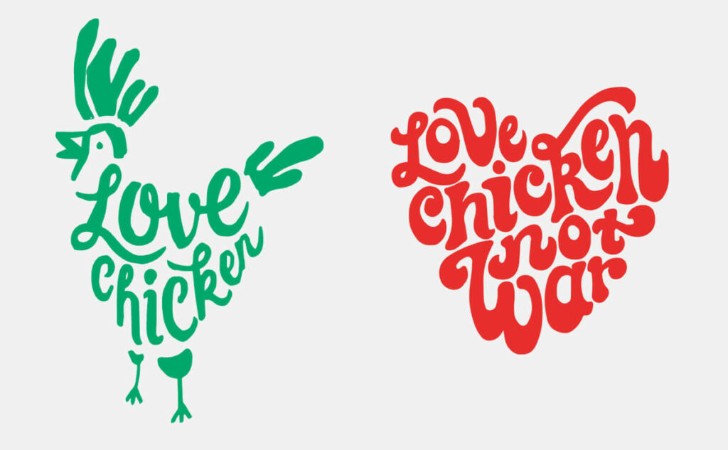
Throwback Friday. A recent trip through Queenstown reminded me that Love Chicken does one of our favourite burgers. Which is just as well, because we designed the identity for the owner, Darren Love, as well as the mural inside. Love Chicken has been open a little while now and has established itself as THE place to get your chicken fix in the Central Lakes. They use organic Bostock Brothers chicken, and their sauces and salads are all made in-house. Another reason to cross the road…
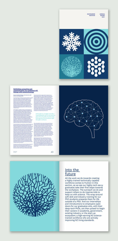
Yes, annual reports are still a thing. We spent the 80s and 90s designing annual reports for large power companies, amongst others, and thought we’d seen the end of lining up rows of financial results in 7pt Franklin Gothic. However, when the MacDiarmid Institute came to us requesting a report that had only 5% pages of financials and 95% new science, we said ‘heck yeah’.
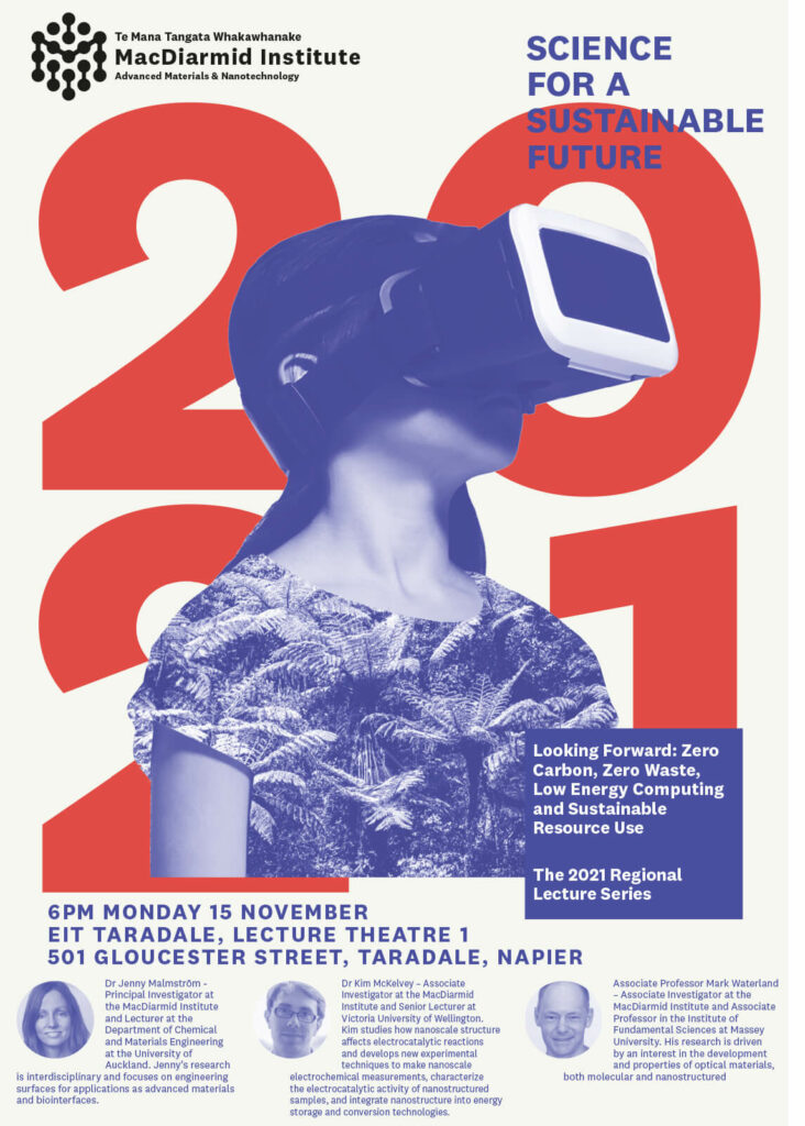
We’ve worked with the MacDiarmid Institute for a few years now, and am continually blown away by their discoveries in materials science. They are at the forefront in investigating cleaner and better ways for new materials to basically save the planet (think solar cell and waste water tech) as well as lessening our dependance on fossil fuels. In 2021 we created posters for a series of lectures that happened around the country, informing people in the provinces about the cutting edge of zero carbon tech and sustainable resource us – taking the message to the people.
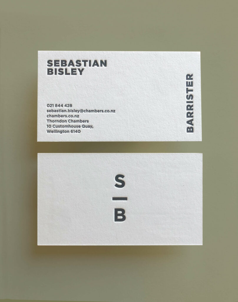
We’ve done a heap of identities for baristas, but not too many for barristers. This is a freshly minted logo and letterpress cards (by Magpie Press) for Sebastian Bisley, Barrister. The client’s love for brutalist architecture (heavy card stock and fonts) and high end mountain bikes (a bar – get it?) was the starting point for this non-traditional law identity.
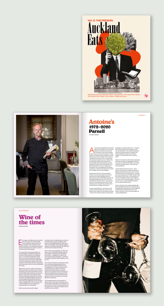
Working on this book bought with it a series of emotions. While a great project to work on, with an enthusiastic client, there were moments of sadness looking at some of the businesses in here, and their operators, who have passed. People who changed the way we eat, who led Auckland (and NZ) out of the food wasteland that was dining in the 60s and early 70s. On the upside, there’s a focus in this book on the strong women, who worked in hospo through the 80s and 90s when kitchen life was real hard (it still is), but who also partied hard. Some good friends are featured in here, with period photography, interviews and some wonderful recipe illustrations by Kohl Tyler-Dunshea. Available now through the Lazy Susan website. Eat up.
One of the things about living in a small community is that often, if you want something done, you have to do it yourself, with the help of the rest of the village. That was the case with developing a website for Ophir, the small Central Otago settlement we call home. While the website was designed and built by Gas, large parts were researched and written by a number of folks in the village, with images, both historic and modern day, coming out of albums from others. It’s part of an ongoing project to document the town’s history and collect stories from some of the older residents before their memories become like us after a couple of jugs of pinot at Blacks pub.
When we first moved to Otago, friends would ask “why would you want to move there?”. Well, this site just might answer that question. Hit this link to visit the site, or hit the trail to visit the town.