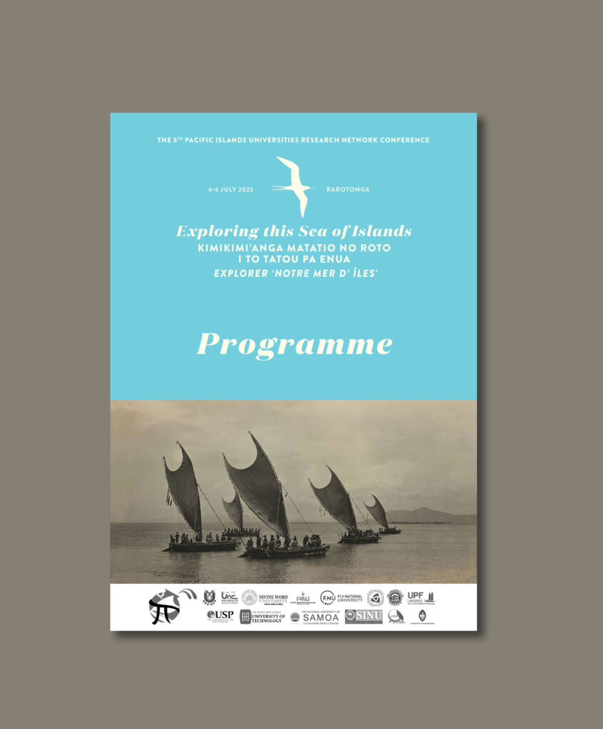
Lurking under a year’s worth of work, we’ve discovered a programme cover we created for a conference in Rarotonga in 2023. Along with the full program, we developed the identity for the conference and created signs, banners, social screens and a website. It pays to keep exploring.
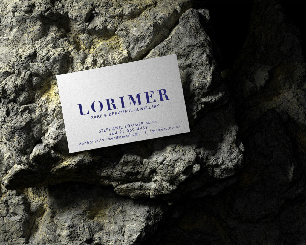
We recently completed a simple identity for a jewellery designer based in Central Otago. As with jewellery, its all about the details – so we took the business cards to the next level with some letterpress-printed cards by Magpie Press.
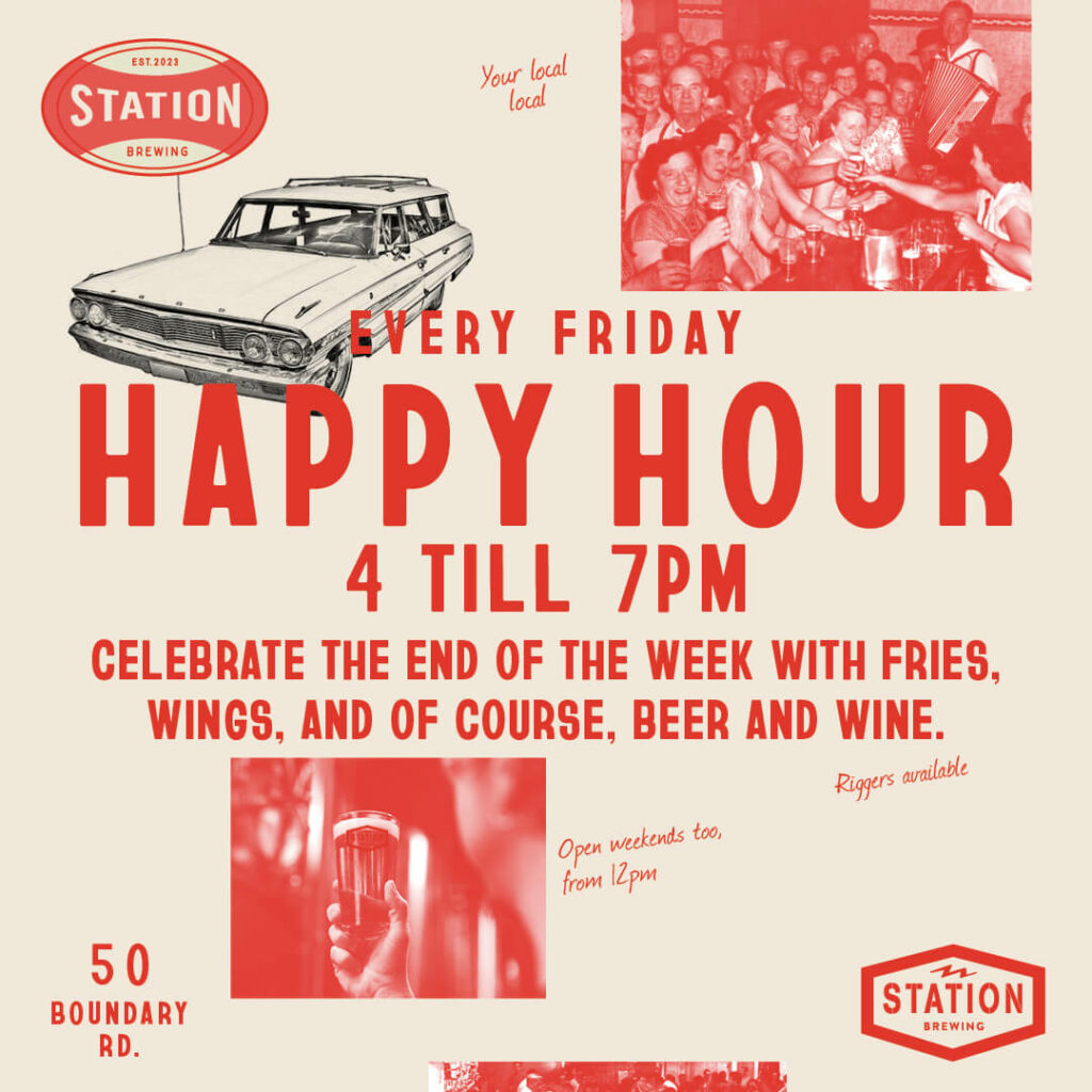
It’s true, we will sometimes work for beer. Station Brewing are a small batch brewery based in Alexandra. We’ve known the owners for a couple three years now, and were chuffed to be asked to help out with some identity and graphic work for the new brewery. We produced some branding, including logo work, website and help with some social media for the 2 owners, who are committed, hardworking, make great beer and undoubtably do the best fries and chicken wings in Central. They’re off the main drag in Alex, in the industrial part of town, occupying a space that used to be a car wreckers. Right up our alley.
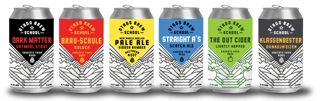
The Otago Brew School is a full time brewery course run by Otago Polytechnic / TePukenga from their Bannockburn, Central Otago / Comwell Campus. The by-product of teaching brewers is they make a lot of beer – in various styles. So they created a retail arm and Gas were tasked with naming, branding and package design. The can design is based on the location in Bannockburn, near Lake Dunstan – an environment surrounded by mountains and dramatic skies. The site is not only a brewery, it is the future of brewing in Aotearoa, by offering hands-on learning to help craft the next generation of brewers. We’ll drink to that.
Wanaka-based the Gleam Team came to Gas Project for a brand new identity. The logo is based on the two owners, and the ladder reflects the nature of their business – Wanaka has some large houses with equally impressively-scaled windows. We also designed their van livery – the swirls are roughly based on the movements of a squeegee. The van is also as clean as their windows – it’s fully electric. Go Team!
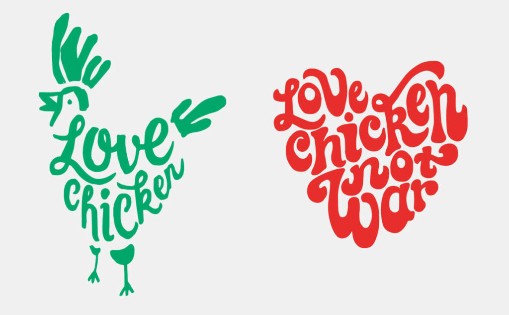
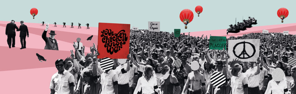
Throwback Friday. A recent trip through Queenstown reminded me that Love Chicken does one of our favourite burgers. Which is just as well, because we designed the identity for the owner, Darren Love, as well as the mural inside. Love Chicken has been open a little while now and has established itself as THE place to get your chicken fix in the Central Lakes. They use organic Bostock Brothers chicken, and their sauces and salads are all made in-house. Another reason to cross the road…
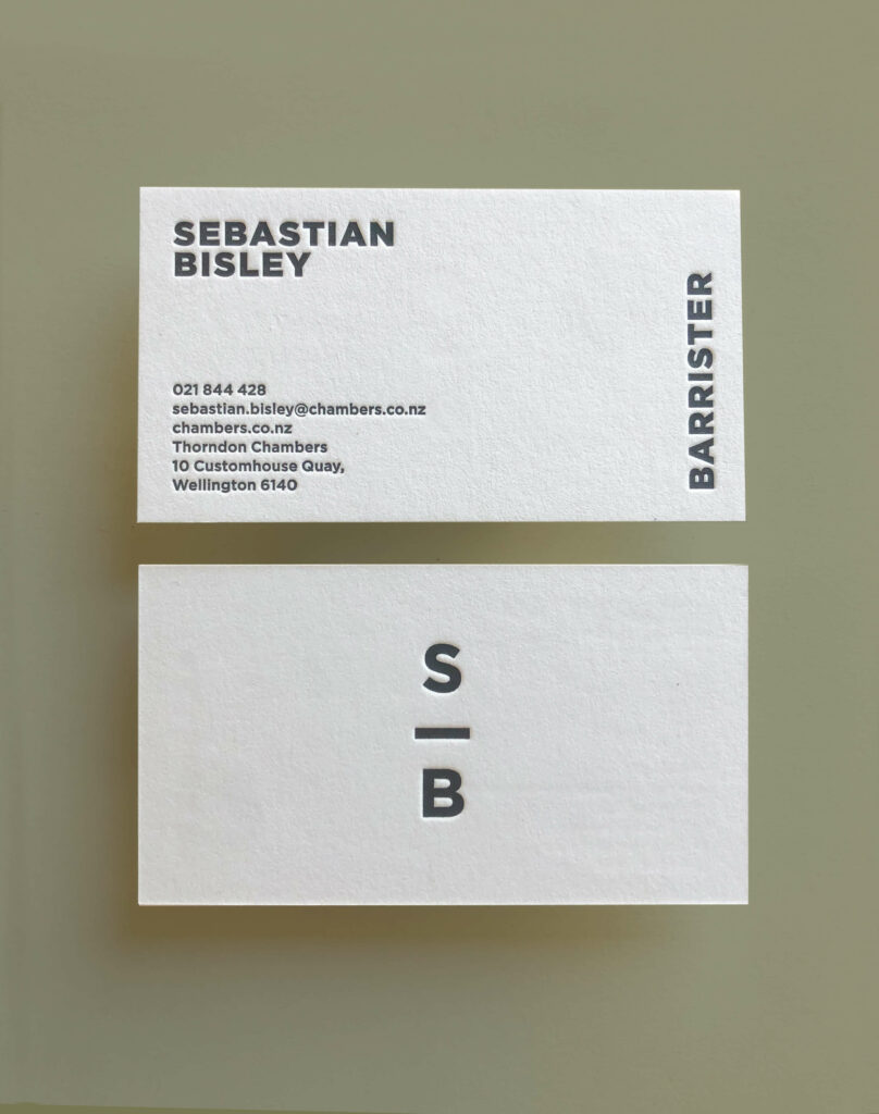
We’ve done a heap of identities for baristas, but not too many for barristers. This is a freshly minted logo and letterpress cards (by Magpie Press) for Sebastian Bisley, Barrister. The client’s love for brutalist architecture (heavy card stock and fonts) and high end mountain bikes (a bar – get it?) was the starting point for this non-traditional law identity.
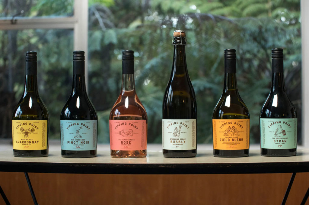
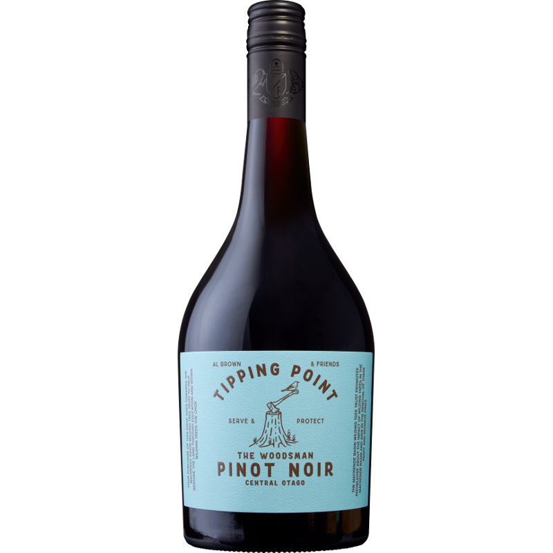
Al Brown and some of his winemaking friends joined forces to launch Tipping Point, a wine brand that not only supports charities close to Brown’s heart but also celebrate the regions. Constellation Wines approached us to help brand and label the new series. It’s always a pleasure working with Al, and being able to colab on a wine label was almost a dream brief. Parts of the design process, and most of the winemaking process was documented on video, here. Now available in supermarkets and wine stores, sales have exceeded expectations – always a good result. The wine tastes pretty good too.
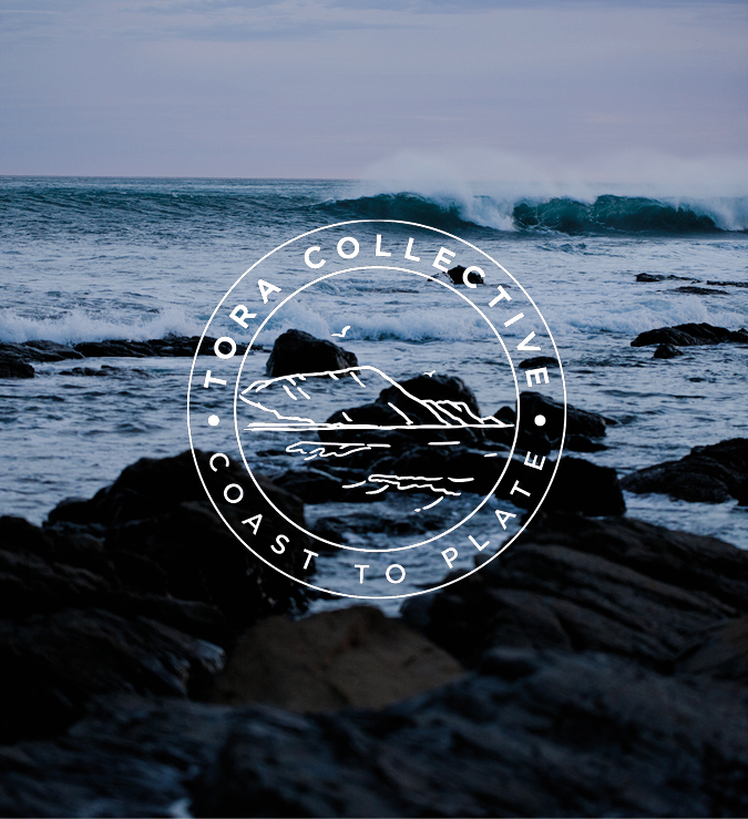
The Tora Collective sustainably catch wild kaimoana from the nutrient-rich waters of Tora, on the beautiful and rugged South Wairarapa Coast. They then pack fresh (again, sustainably) and ship to restaurants and homes, straight from the ocean. We helped create a brand for this amazing company, having first met them on a photo assignment for an Al Brown cookbook. Salt water flows in their veins.
Since moving to Central Otago (now two years and counting), we’ve found an environment of extraordinary beauty, rich histories and grounded people. It’s not everyone’s cup of milky tea – the weather can be brutal (we’re acclimatising), the supplies short (“that’ll take a couple o’ weeks to come in on the stage”) and the food expensive, but we wouldn’t want to be anywhere else (written as the country is in a level 4 Covid lockdown).
Part of the move here was try to work with the locals, which sometimes means working as a favour. In small communities like this, you really need to pitch in to get things done. So we were more than happy to help with a small identity for Heritage Central Otago.