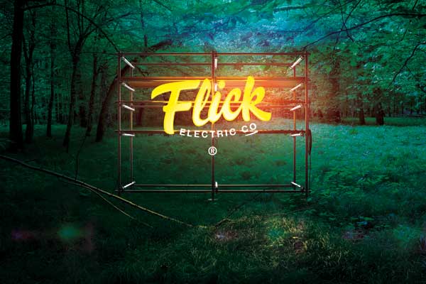
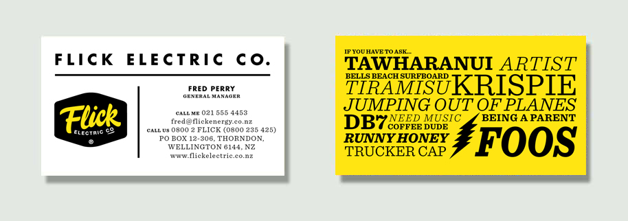
August 16th, 2015 § § permalink
Call it a dream brief. A group of young, (very) smart and talented people get together and decide to create a power company to take on the big boys by selling electricity in a completely new way. Then call it ‘Flick‘. Gas developed the brand strategy, created the identity and helped with rollout of stationery, T shirts and environmental graphics in their new offices. Good folks and clever flickers.
January 3rd, 2015 § § permalink
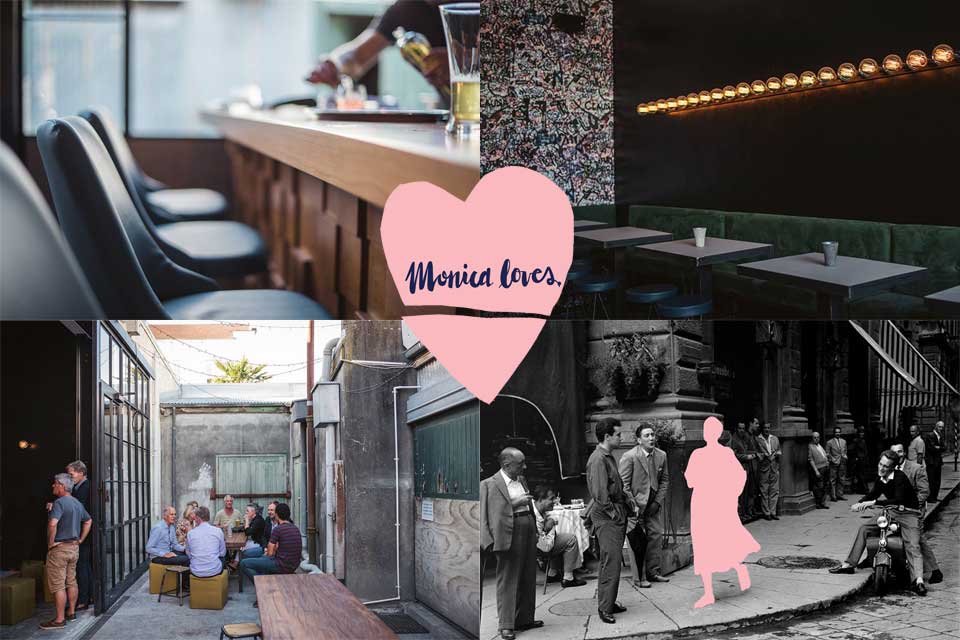
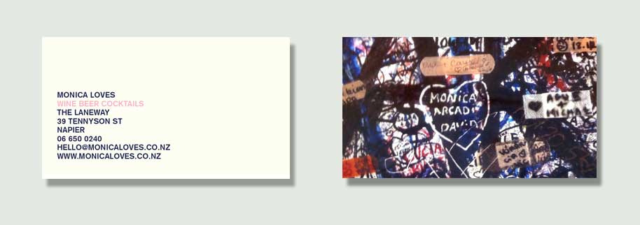
The regions deserve more love. While there’s a new bar opening in Auckland every week (and one closing down), Napier hasn’t seen a lot of action. That was until December when a new kid on the block opened (and created by) the good folk at Mister D on Tennyson St. Monica Loves is a grown-up sort of place for people who’ve travelled and love travelling. The name and interior were inspired by a graffiti wall in Verona, near the Romeo and Juliet balcony. As well as branding and graphics, Gas also worked on the interior design and found there’s no shortage of talent in ‘the Bay’. Another great reason to visit.
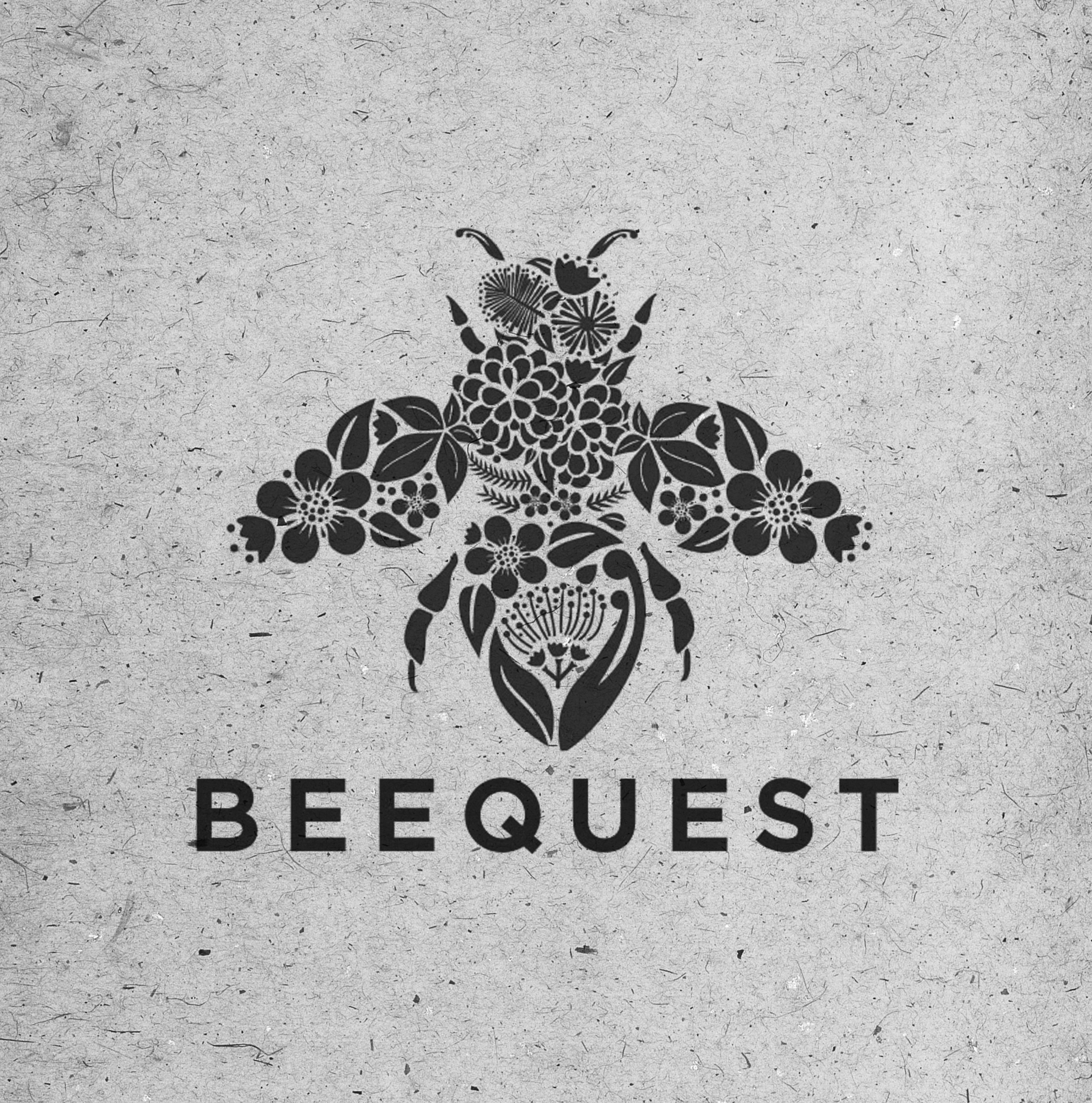
July 30th, 2014 § § permalink
Beequest make some of the best tasting honey this side of Pooh’s larder. Gas were approached to create an identity and labels for this small producer. Job done! A big thanks once again to illustrator Lisa Moes for making us look good.

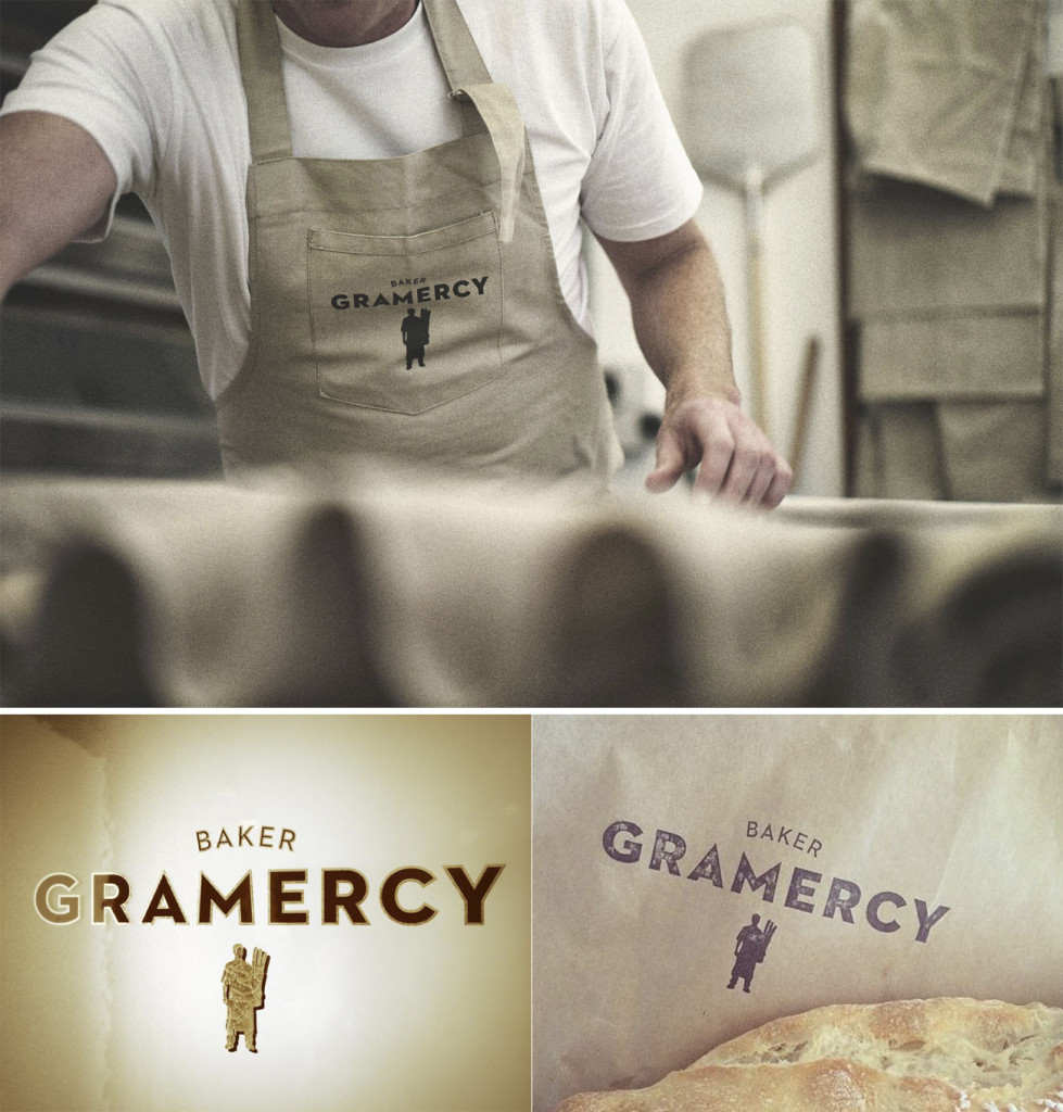
July 28th, 2014 § § permalink
Gramercy is helping put the love back into Wellington suburb Berhampore. Fresh-baked breads and pastries made on site, twinned with Supreme coffee have made this bakery one of Wellington’s best kept secrets – until now we guess. Gas worked with the owner on branding and website and provided advice on shop design. A big thanks to Joe Kelly for the web photography, Jon Wall for the web build and Watermark Signs for the nice, shiny door graphics. Almost everyone involved works only a couple of Ks from the store making this a real local effort. Which is just the way we like it.
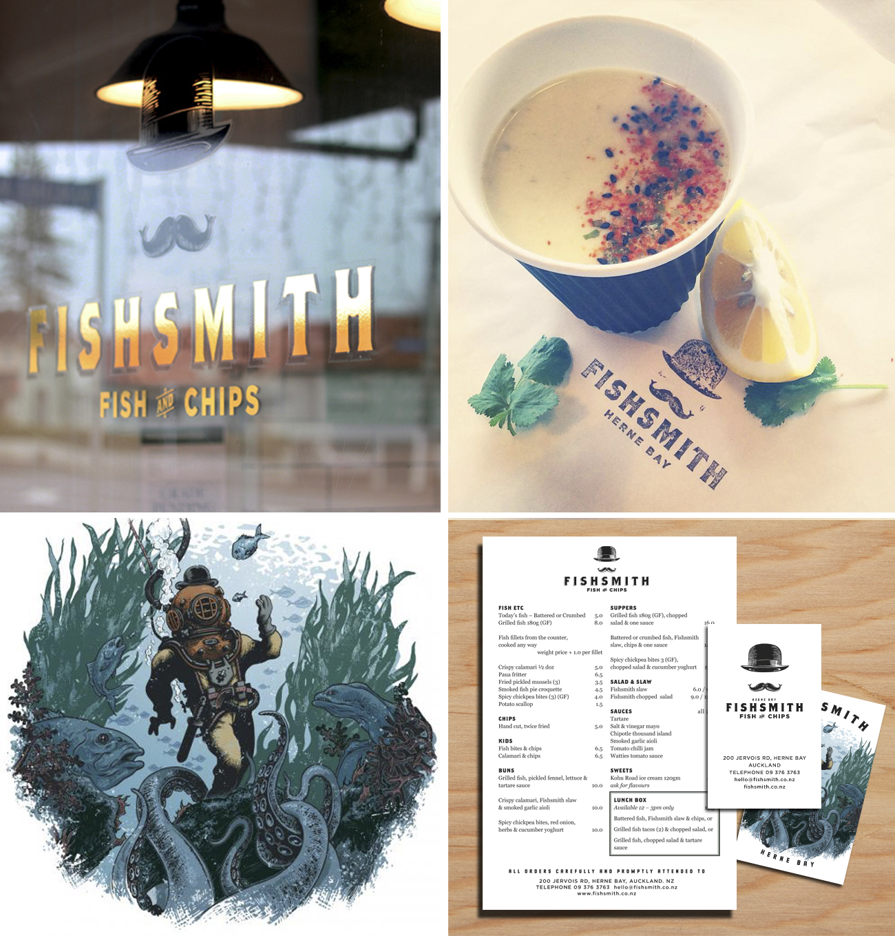
July 28th, 2014 § § permalink
We’ve recently completed fitout and brand design for a new chippy in Herne Bay in Auckland. Say hello to ‘FishSmith’, a fresh take on the classic Fish & Chip shop. Working with client Mr Scott Brown, the look was based on the age of the building, with a simple tile and wood interior and mural by Mr Blair Sayer of Sydney. The logo uses an etched bowler hat and two ‘kissing fish’ moustache, although the owner remains resolutely un-tached.

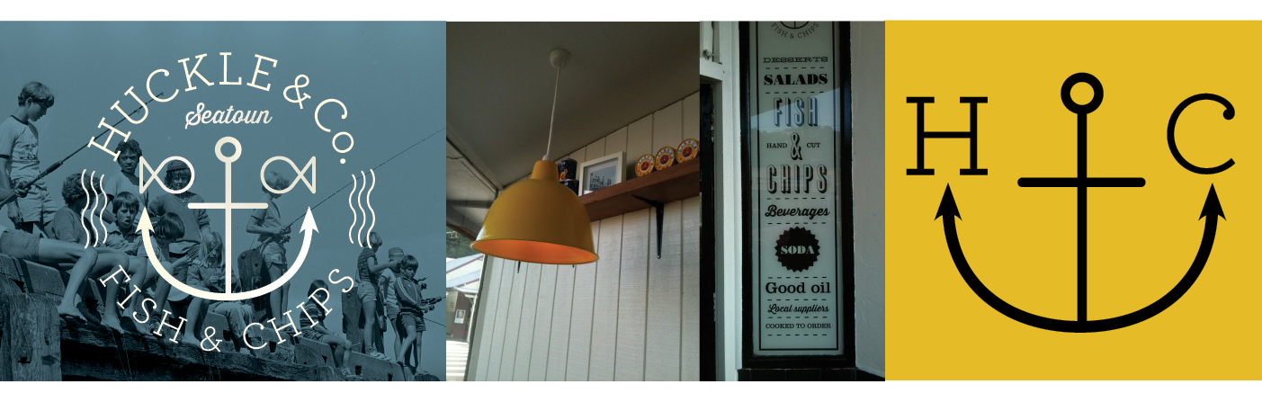
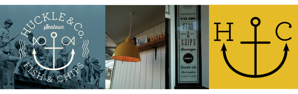
February 26th, 2014 § § permalink
Huckle & Co are a newly opened fish and chip shop in Seatoun. Gas worked with the owner Dave Thurlow (ex Polo) on the interior design, brand and signage. Named after a Richard Scarry character (the clients nickname as a child), we looked to keep things bright and fun. It seems the locals like what Dave does as often there are lines out the door. Try the fish. Heck, try everything. Just get there early on a Friday.
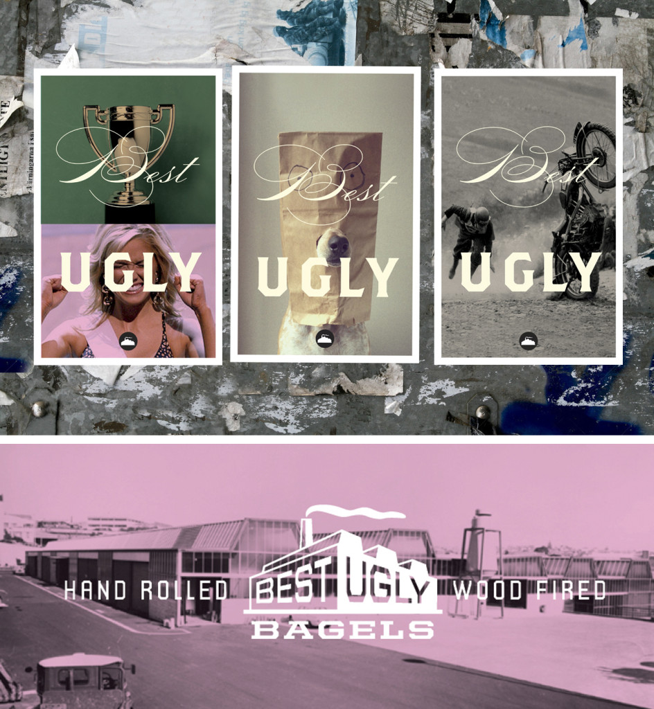
February 26th, 2014 § § permalink
Best Ugly is a bagel factory and cafe in central Auckland. Gas worked with Chef Al Brown to develop the identity, print, signage and web materials to promote and package the best (and hand-rolled – hence ugly) bagels around. Serve toasted.
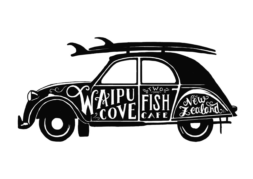
October 30th, 2013 § § permalink
A work in progress for the guys at Two Fish Cafe in Waipu. Thanks to the talented Lisa Moes for the nice line work.
October 9th, 2013 § § permalink
A logo for the band 3 Shots to the Head, with lead singer Dave Griffiths from Mister D Dining in Napier.

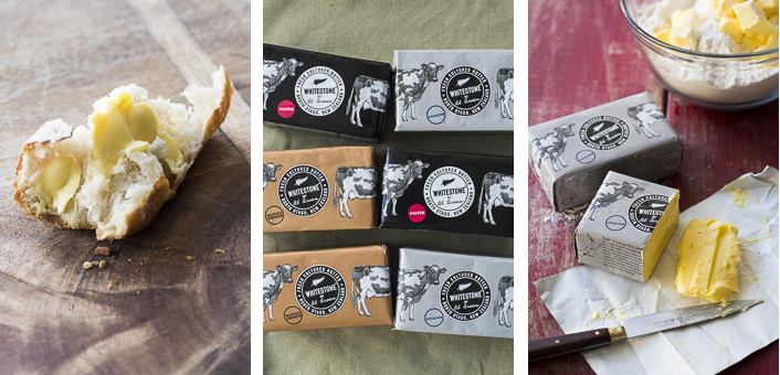
June 16th, 2013 § § permalink
We live in a sort of dairy paradise (unless you look at our rivers, but that’s a whole ‘nother story), so why has it taken so long to get good butter here? Its like buses. You wait for ages, and then all of a sudden, along come two. Well this one has well been worth waiting for. Al Brown and Whitestone Cheese teamed up some time ago to produce the freshest, tastiest and yellowist butter a toast-loving kiwi could wish for. Yep, it even tastes good on that dreadful gluten-free stuff. Gas were lucky to join early prototype-tasting sessions and for the last two weeks have been rediscovering what bread should taste like. Oh yeah, and we also designed the packaging. Tip-o-the-hat to Andy Warhol for some Pop Art-style inspiration. Available in three ‘flavours’ from selected supermarkets, Farrow Fresh in Auckland and Best Ugly bagels (more about that later), its yellow goodness. Go to the spreadthelove site to learn more.