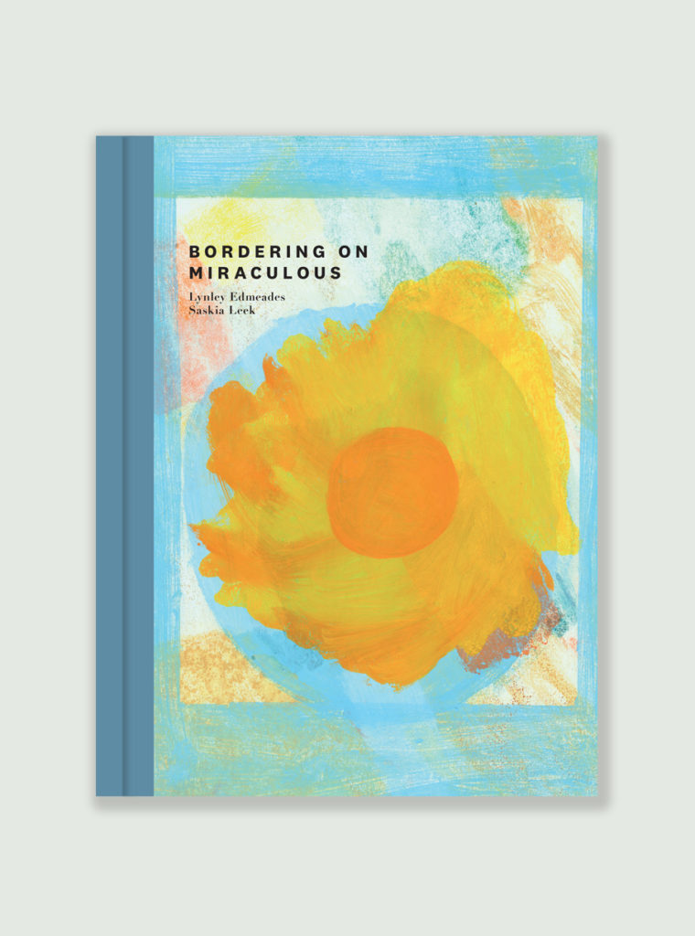
This is fourth book in the kōrero series from Massey press of ‘picture books for grownups’, we’ve designed. Gas worked with the very talented poet Lynley Edmeades and artist Saskia Leek to produce, what is to date, certainly the most colourful book so far. Available from good independent bookstores, or through the Massey Press website. Miraculous.
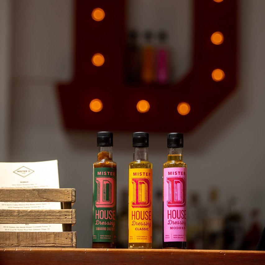
Mister D Dining in Napier asked us to design some labels for their new range (of frankly, delicious) dressings. Taking our cues from the interior (which we also originally helped with), the oils come in three flavours / colour ways and are available from the restaurant.
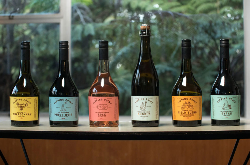
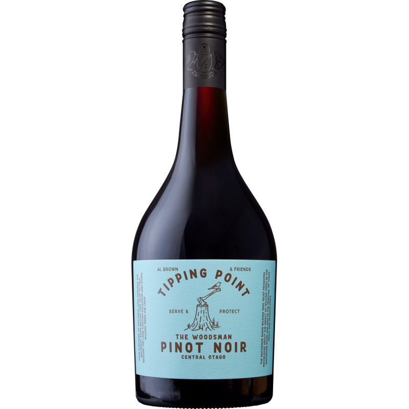
Al Brown and some of his winemaking friends joined forces to launch Tipping Point, a wine brand that not only supports charities close to Brown’s heart but also celebrate the regions. Constellation Wines approached us to help brand and label the new series. It’s always a pleasure working with Al, and being able to colab on a wine label was almost a dream brief. Parts of the design process, and most of the winemaking process was documented on video, here. Now available in supermarkets and wine stores, sales have exceeded expectations – always a good result. The wine tastes pretty good too.
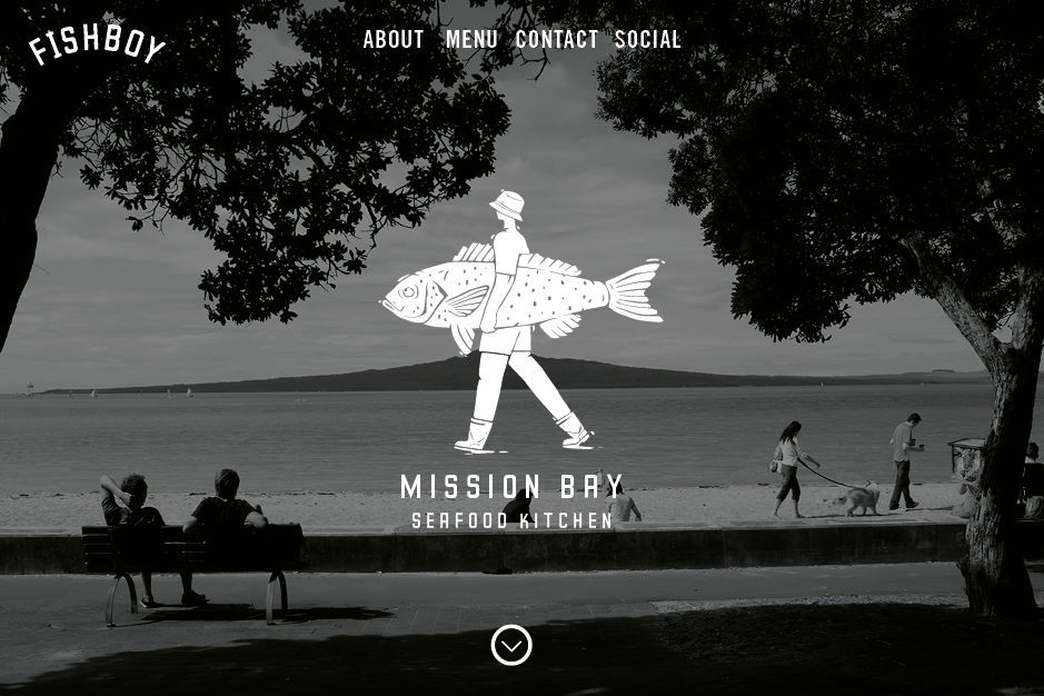
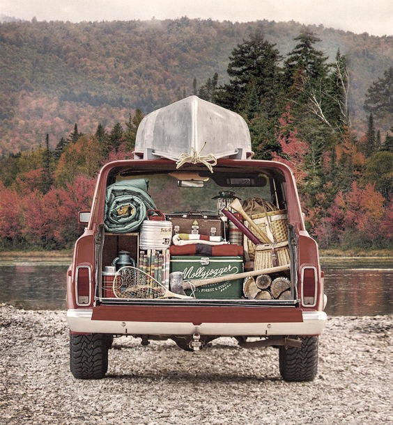
Fishboy is / was the brainchild of Scott from FishSmith, a next-level F&C joint in Herne Bay we branded a few years ago. Fishboy shone brightly but recently sold, we’re not sure if the new owners will stay with the identity we put together. Our involvement included designing the identity, signage and website (built by HiHo).
Anyway, here’s the way it came together. Never got a chance to try their fish tacos either…
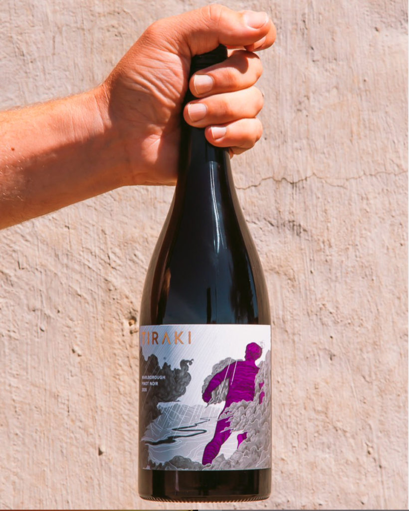
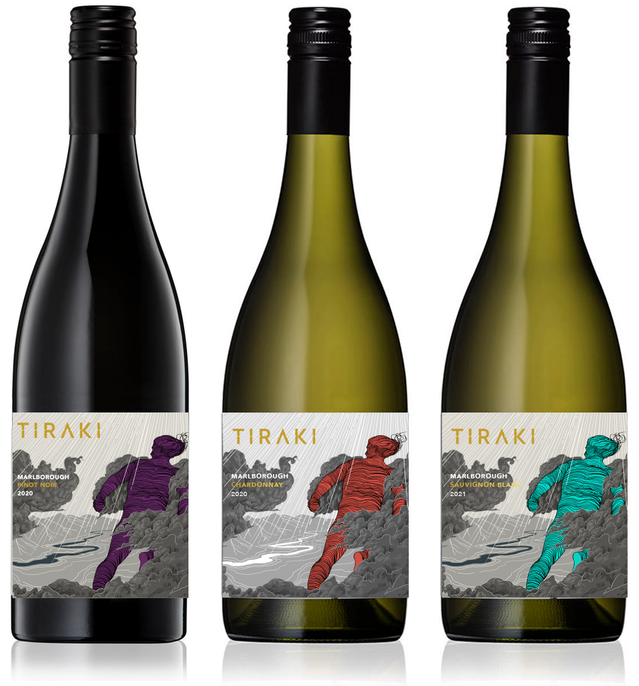
Marlborough is brilliant wine growing country – it’s surrounding mountains mean westerly clouds are parted to imbue the region with more sunshine hours than almost anywhere else in Aotearoa. That parting of clouds inspired the name of Tiraki, a small winey created by a new generation of an old farming family. Gas Project were tasked with creation of a brand identity and label that had one foot in the tradition of wine, and one firmly in the new world, with sensitivities around environment and tangata whenua, while also being a little adventurous. Inspired by myth, the work of artist Euan McLeod and comic books, Reuben Smith worked up the illustration while we focussed on the brand and typography (and a little wine research). Sometime we love our jobs.
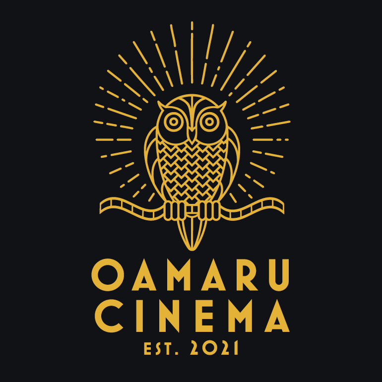
Oamaru was without a cinema for two years before new owners took the challenge on to restore the old space and upgrade it with state of the art seating, sound system and projection equipment. We were tasked with developing an identity that would be distinctive and carry some Art Deco vibes to tie in with the interior. The idea of an owl seemed appropriate – it sits in the dark but sees everything. We had a hoot working on this one.
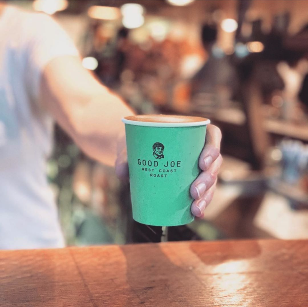
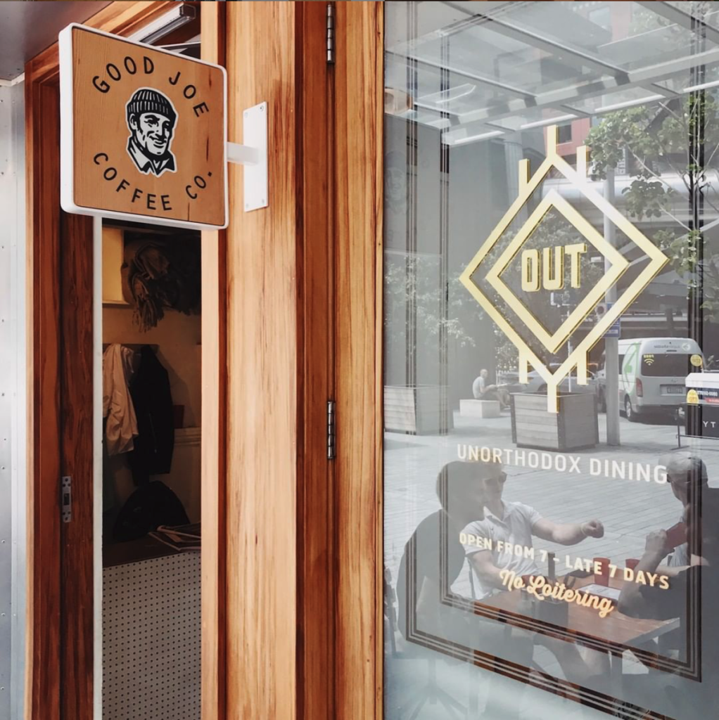
Good Joe is a coffee blend developed by High Noon coffee and Al Brown for pouring in all of Al’s hospitality offerings, like Best Ugly Bagels, The Federal Deli and Depot. Joe ain’t fancy, but Joe is a great, honest drop. Head online to buy direct (we’re currently working on website updates), as well as developing the identity and packaging, alongside the very talented Hayley Brown from NY Art Dept. Good-o.
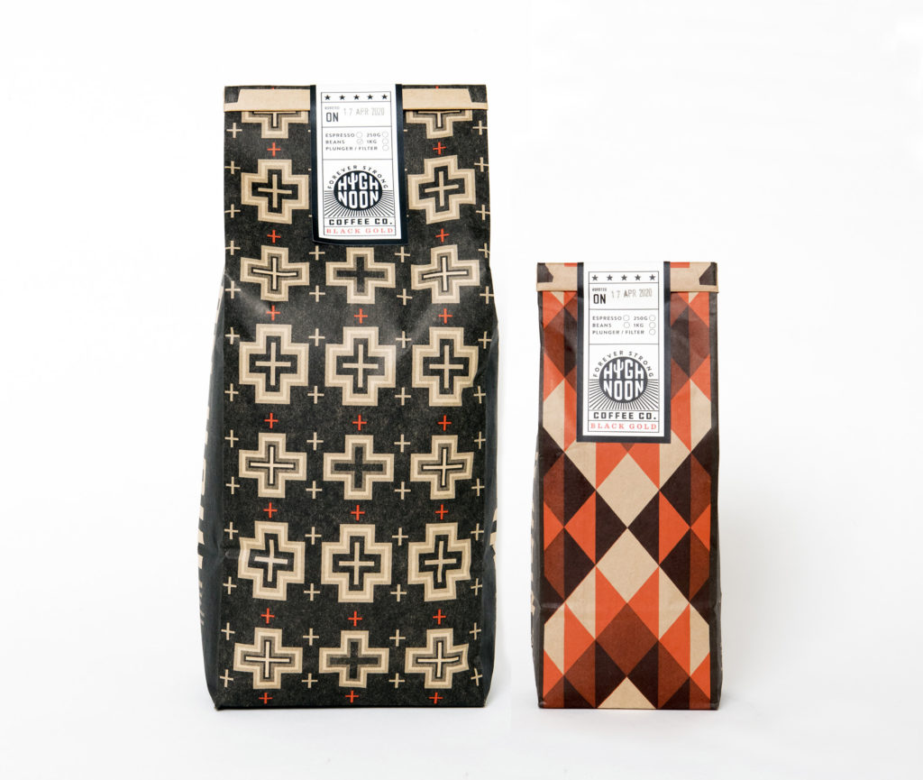
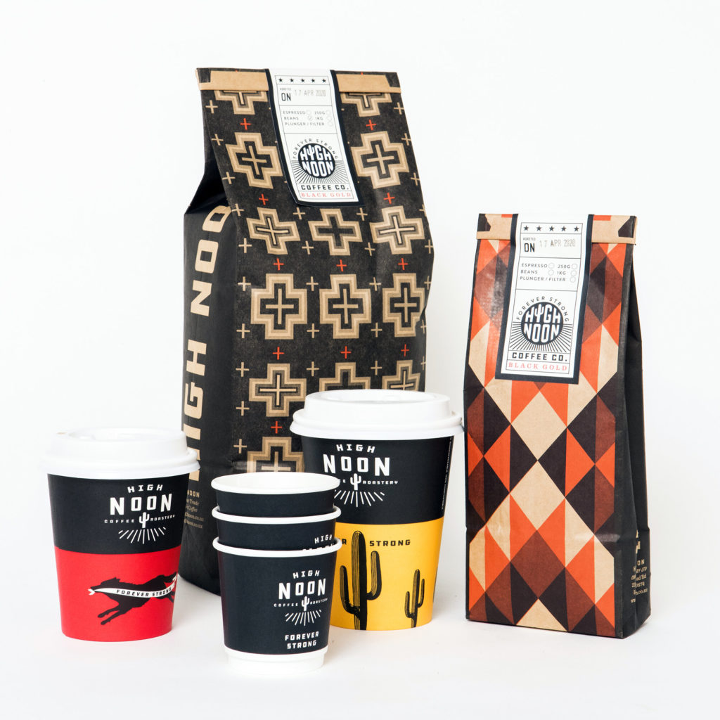
Small for producers are either brave, or crazy, or both. Tim Rose from High Noon coffee roasters, west of Auckland, is definitely both, and also one of the nicest folks you could hope to meet. A consummate creative guy, he converted an old shed on his farm (actually it’s more like a food forest) into a roastery and has been brewing up and delivering the goods since, well, last year. We worked alongside Tim and partner Helen to develop an identity and packaging, drawing inspiration from the old west, the new west, and points in between.
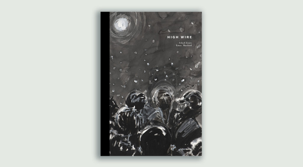
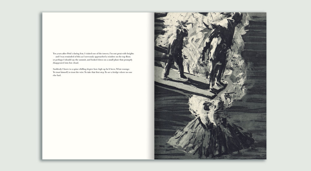
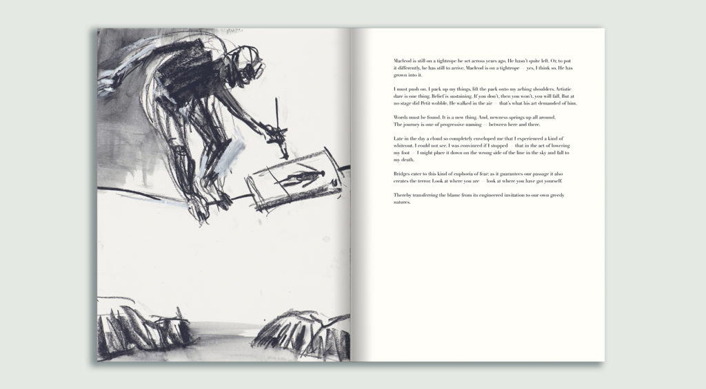
Lloyd Jones is an incredible writer. Euan Macleod is an astounding painter and artist. Designing a book where their talents are combined was a huge privilege and a little daunting. Trying not to come off as too much of a fan-boy whenever we met to discuss the project proved difficult, but the book itself fell into place very easily. Think of High Wire as a picture book for grown ups. It’sthe first book in a series where artists and photographers are paired with writers and poets. We can’t wait to get stuck into the next one.
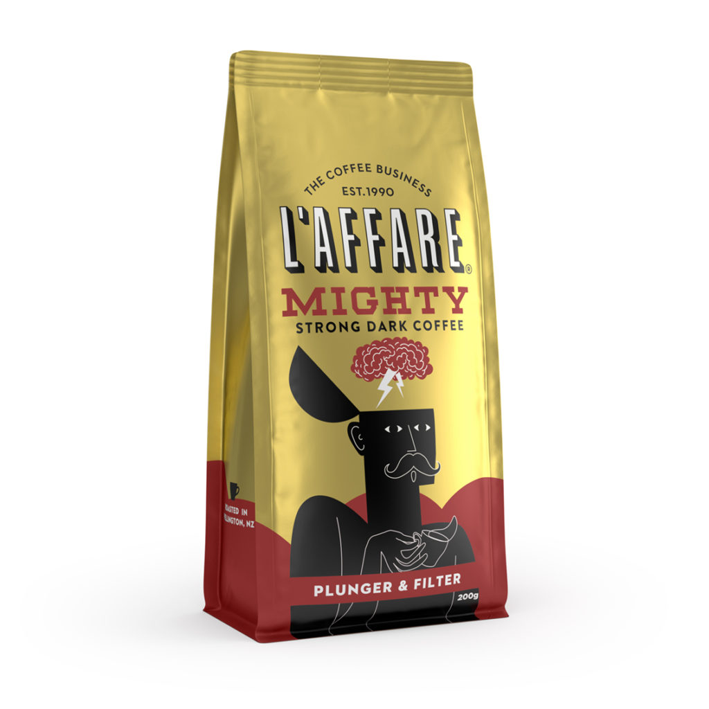
L’affare are a long-time Gas Project client and a bit of an institution in the coffee world. Since helping develop the L’affare brand and champion, Enzo, in the 1990s, we’ve been involved in incremental updates to L’affare’s retail packaging since. The introduction of their first strong blend, Mighty, offered an opportunity to revisit the character of Enzo, so we worked with illustrator and designer Rokas Aleliunas to reinterpret him. His work blew our minds, pretty much in the same way as a really good, strong coffee does.