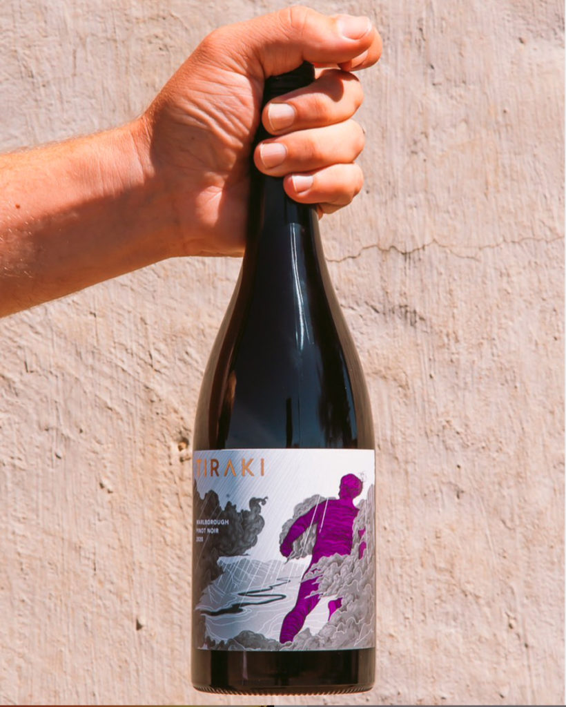
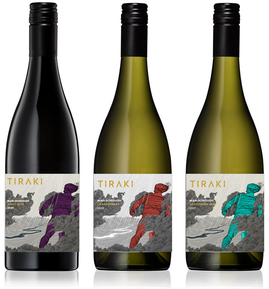
Marlborough is brilliant wine growing country – it’s surrounding mountains mean westerly clouds are parted to imbue the region with more sunshine hours than almost anywhere else in Aotearoa. That parting of clouds inspired the name of Tiraki, a small winey created by a new generation of an old farming family. Gas Project were tasked with creation of a brand identity and label that had one foot in the tradition of wine, and one firmly in the new world, with sensitivities around environment and tangata whenua, while also being a little adventurous. Inspired by myth, the work of artist Euan McLeod and comic books, Reuben Smith worked up the illustration while we focussed on the brand and typography (and a little wine research). Sometime we love our jobs.
Oamaru was without a cinema for two years before new owners took the challenge on to restore the old space and upgrade it with state of the art seating, sound system and projection equipment. We were tasked with developing an identity that would be distinctive and carry some Art Deco vibes to tie in with the interior. The idea of an owl seemed appropriate – it sits in the dark but sees everything. We had a hoot working on this one.
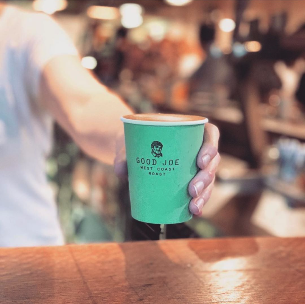
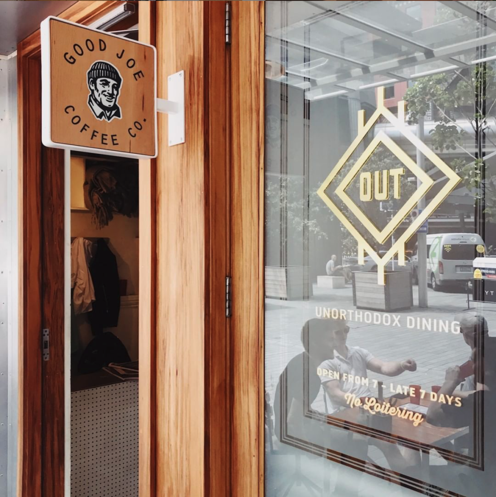
Good Joe is a coffee blend developed by High Noon coffee and Al Brown for pouring in all of Al’s hospitality offerings, like Best Ugly Bagels, The Federal Deli and Depot. Joe ain’t fancy, but Joe is a great, honest drop. Head online to buy direct (we’re currently working on website updates), as well as developing the identity and packaging, alongside the very talented Hayley Brown from NY Art Dept. Good-o.
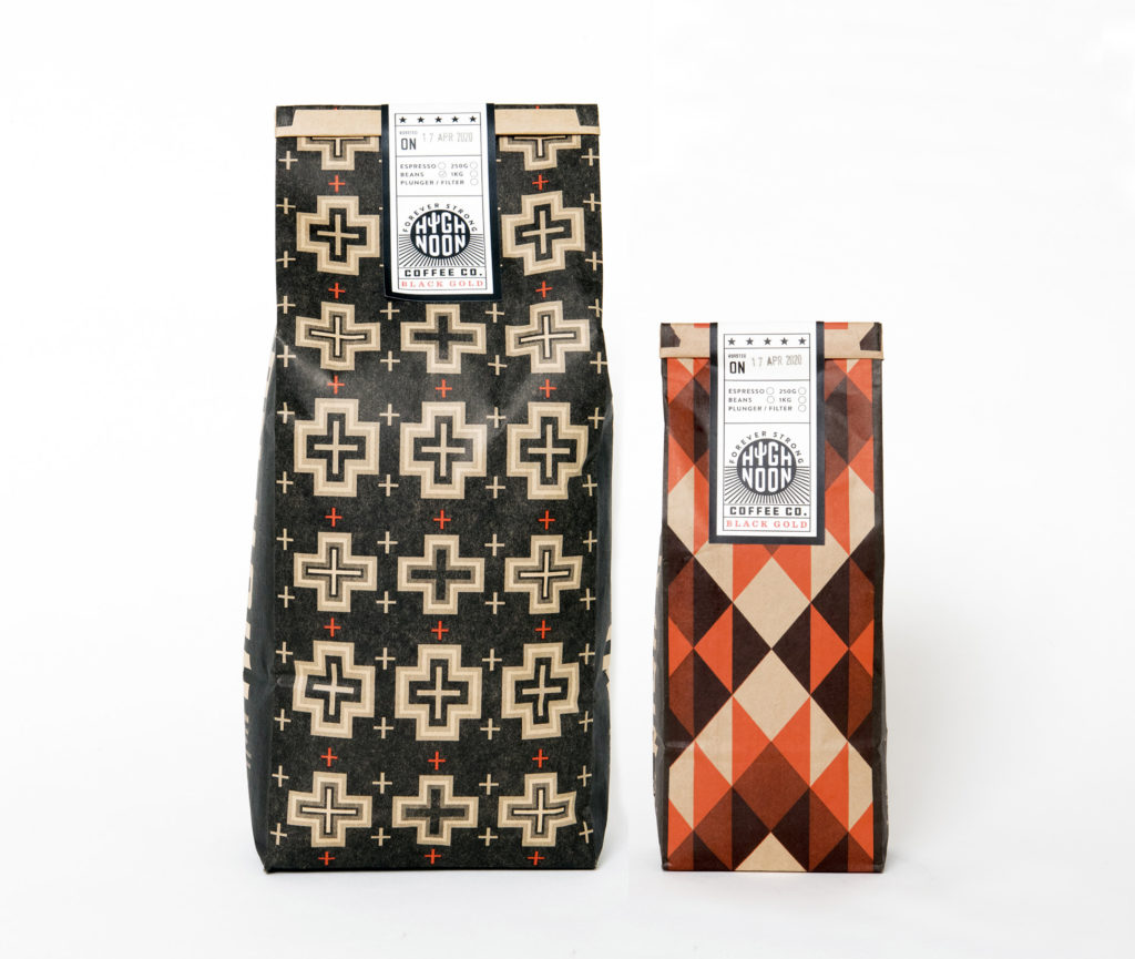
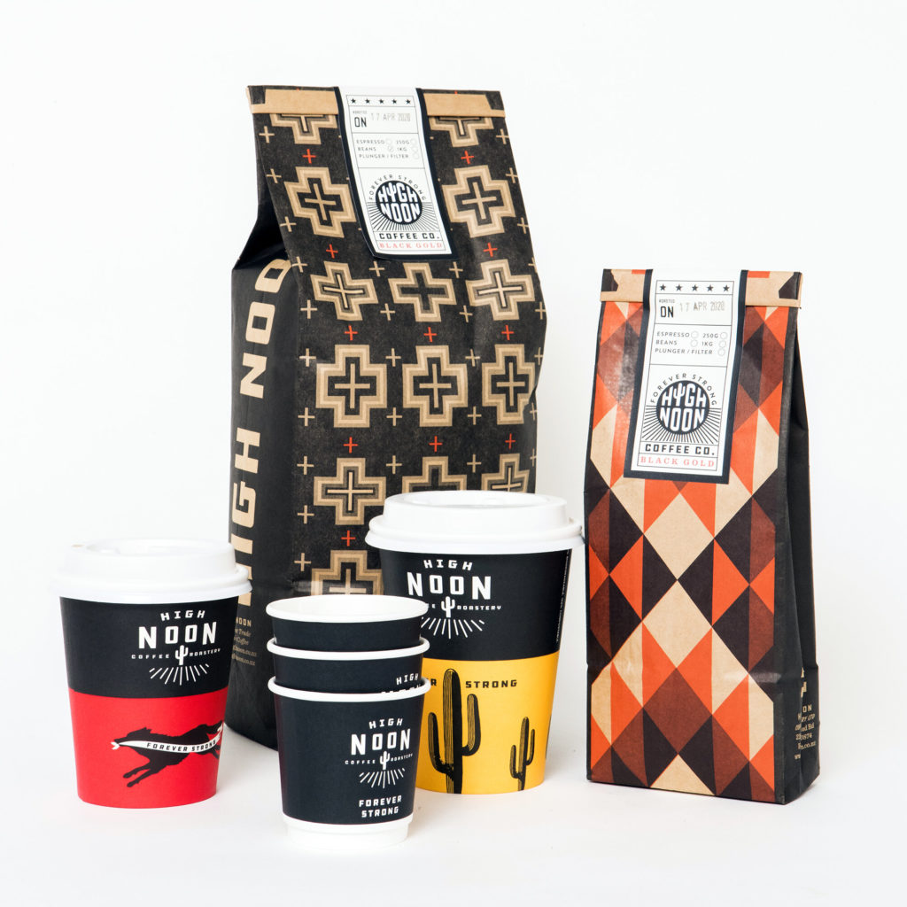
Small for producers are either brave, or crazy, or both. Tim Rose from High Noon coffee roasters, west of Auckland, is definitely both, and also one of the nicest folks you could hope to meet. A consummate creative guy, he converted an old shed on his farm (actually it’s more like a food forest) into a roastery and has been brewing up and delivering the goods since, well, last year. We worked alongside Tim and partner Helen to develop an identity and packaging, drawing inspiration from the old west, the new west, and points in between.
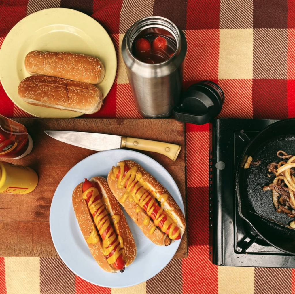
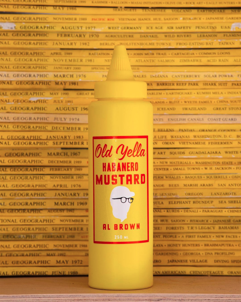
Developed by Al Brown and a favourite condiment at Depot Eatery and the Federal Deli, Old Yella Habanero Mustard has made it into full production and is available for purchase. Of course it needed a bottle and label design that was as simple as the mustard is delicious. Riffing on NYC hot dog stands and old diners, Old Yella packs a punch. Goes with everything.
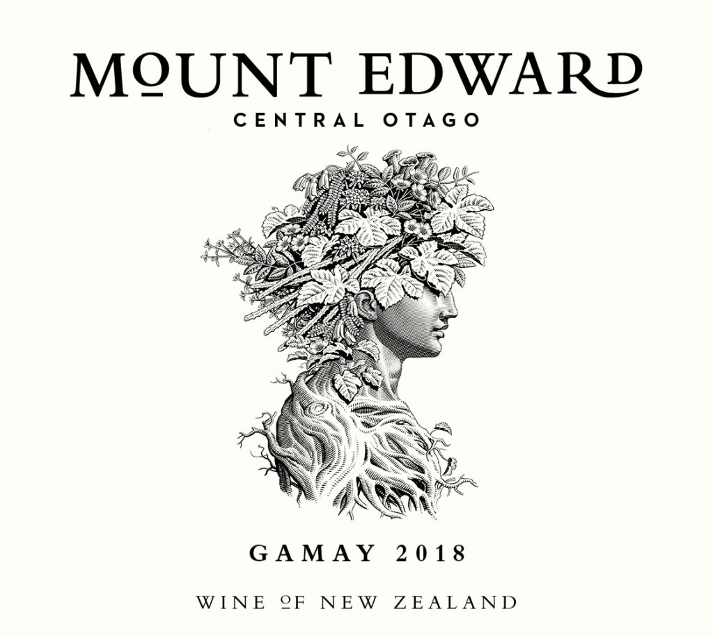
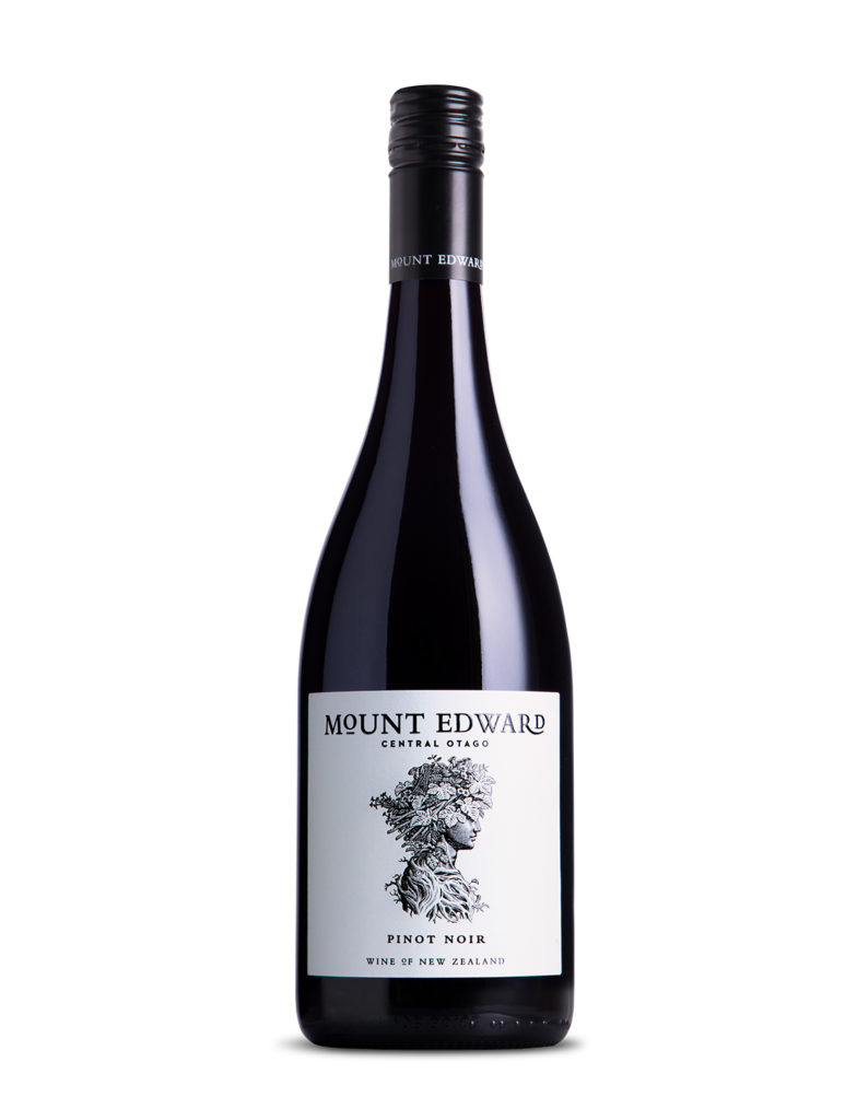
Mount Edward is a Central Otago winery renowned for it’s Pinot Noir and Riesling. We think they produce some of the best wines in the country and wanted to pair the wines with a redeveloped label that carried a similar level of personality as the owners.
Organic, sustainably driven, grown naturally and made with thought for the future, each vineyard is unique, each wine individual. Grow your own way.
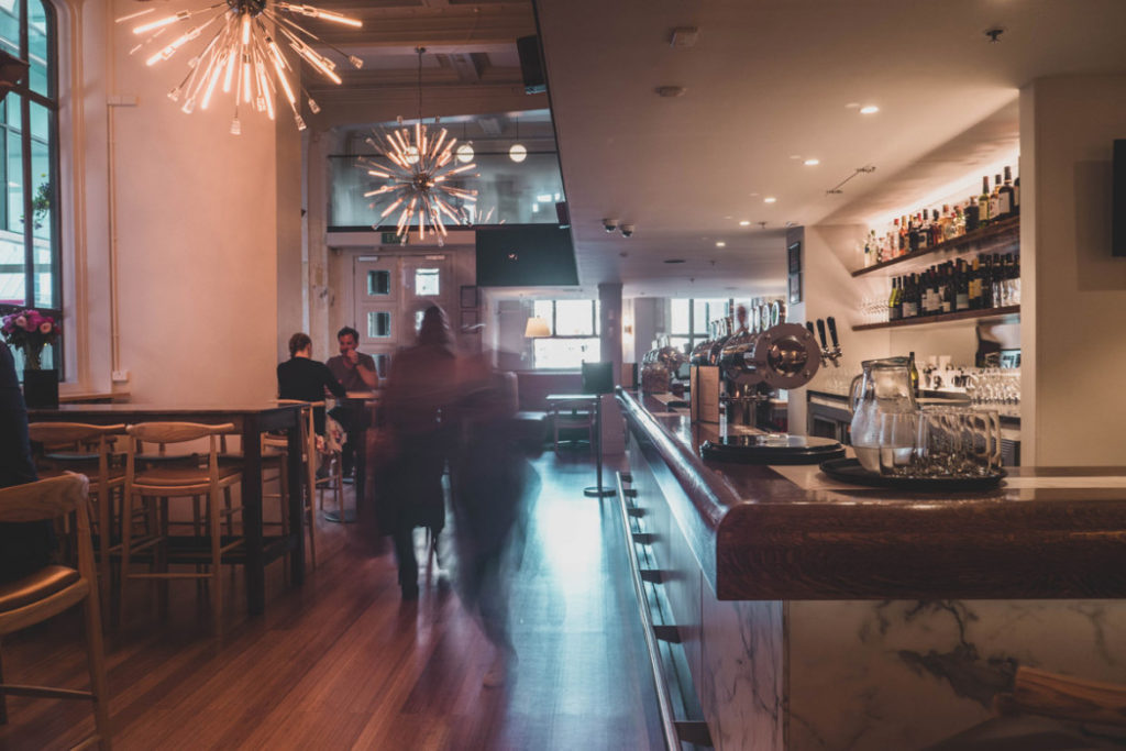
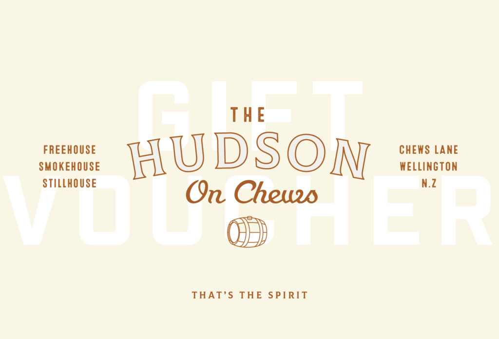
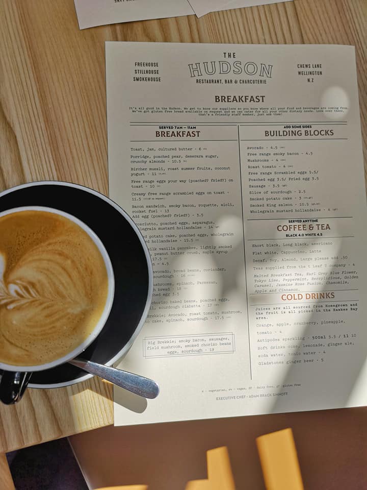
A difficult site and a floor plan butchered by earlier tenants made the design of The Hudson, a bar and charcuterie in downtown Wellington, a real challenge. Gas worked alongside Nott Architects and the client to reimagine a space over two levels that was cosy enough for coffee in the morning, airy enough for a cold beer on a summer afternoon and comfortable again at night for a quiet gin or whiskey. A place where you’d be welcome wearing old jeans or a hand-made suit. The identity system played on the history of the site ( a trading firm in the 1920s) and used images of the first whiskey shipment to the US after prohibition.
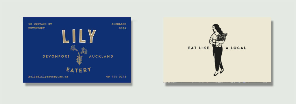
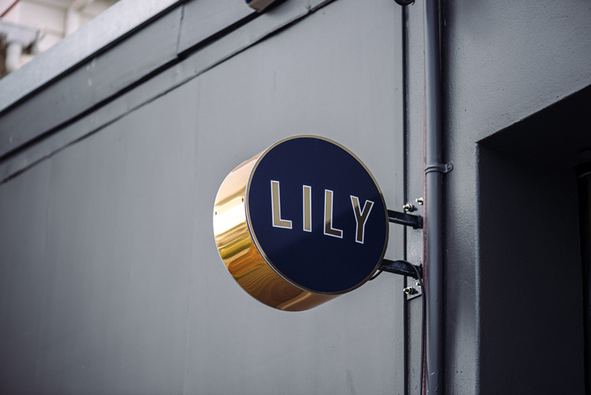
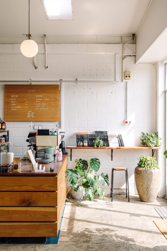
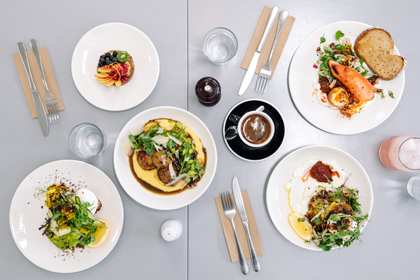
Lily is a small breakfast and lunch eatery down a small street in Devonport. Lily has a big heart and is the love child of Lily and Jason Ng. Lily runs the kitchen, and has a CV that includes time at Baduzzi and Clarence Road Eatery. Almost everything in the cafe is made from scratch, with a food philosophy of simple things made well. We complimented the stripped back interior look by the client with a simple typographic identity with a couple of small illustrated ‘add ons’ and created a website experience equally minimalistic.
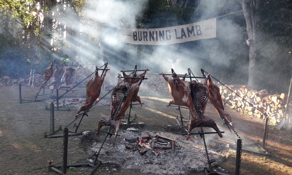
Al Brown doesn’t do anything by halves. When he said he was planning a BBQ for some folks and wanted a logo, we were on board. When he said the BBQ was for 1000 people, with transport to a food forest, live art, drink stations and a concert by Dave Dobbyn, we went overboard.
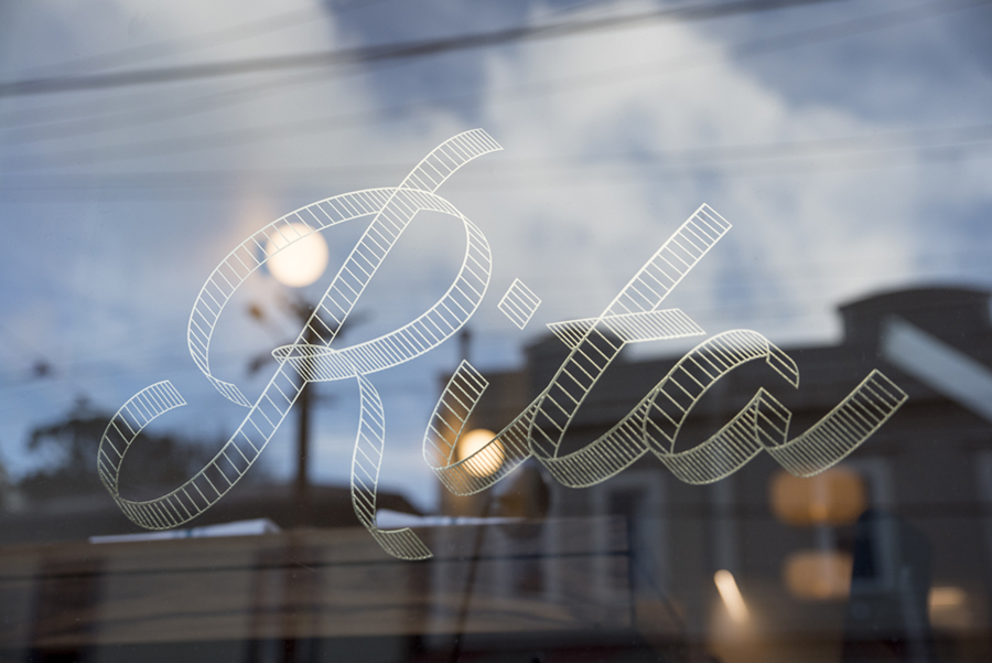
Rita is the second venture by Kelda Hains and Paul Schrader of Nikau Cafe fame. A small dining room, in a small converted shop, on a small street in Aro Valley. The menu is small too, because its a set menu and changes depending on what’s available from the garden and what’s good from their suppliers. The interior is by Mary Daish. In short, it’s a thing of beauty. We were more than happy to help out with an identity and some small pieces of print work. Go now.