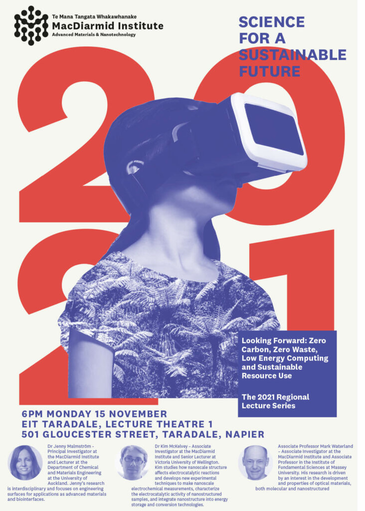
Bordering on Miraculous

March 7th, 2022 § 0 comments § permalink

This is fourth book in the kōrero series from Massey press of ‘picture books for grownups’, we’ve designed. Gas worked with the very talented poet Lynley Edmeades and artist Saskia Leek to produce, what is to date, certainly the most colourful book so far. Available from good independent bookstores, or through the Massey Press website. Miraculous.

Mister D

March 7th, 2022 § 0 comments § permalink

Mister D Dining in Napier asked us to design some labels for their new range (of frankly, delicious) dressings. Taking our cues from the interior (which we also originally helped with), the oils come in three flavours / colour ways and are available from the restaurant.

Tipping Point

February 15th, 2022 § 0 comments § permalink

Al Brown and some of his winemaking friends joined forces to launch Tipping Point, a wine brand that not only supports charities close to Brown’s heart but also celebrate the regions. Constellation Wines approached us to help brand and label the new series. It’s always a pleasure working with Al, and being able to colab on a wine label was almost a dream brief. Parts of the design process, and most of the winemaking process was documented on video, here. Now available in supermarkets and wine stores, sales have exceeded expectations – always a good result. The wine tastes pretty good too.

Tora Collective

August 29th, 2021 § 0 comments § permalink

The Tora Collective sustainably catch wild kaimoana from the nutrient-rich waters of Tora, on the beautiful and rugged South Wairarapa Coast. They then pack fresh (again, sustainably) and ship to restaurants and homes, straight from the ocean.
We helped create a brand for this amazing company, having first met them on a photo assignment for an Al Brown cookbook. Salt water flows in their veins.

Found

August 23rd, 2021 § 0 comments § permalink

Palm Springs. It’s like Alexandra, but with better architecture.

Heritage

August 23rd, 2021 § 0 comments § permalink

Since moving to Central Otago (now two years and counting), we’ve found an environment of extraordinary beauty, rich histories and grounded people. It’s not everyone’s cup of milky tea – the weather can be brutal (we’re acclimatising), the supplies short (“that’ll take a couple o’ weeks to come in on the stage”) and the food expensive, but we wouldn’t want to be anywhere else (written as the country is in a level 4 Covid lockdown).

Part of the move here was try to work with the locals, which sometimes means working as a favour. In small communities like this, you really need to pitch in to get things done. So we were more than happy to help with a small identity for Heritage Central Otago.

Oh boy!

August 23rd, 2021 § 0 comments § permalink

Fishboy is / was the brainchild of Scott from FishSmith, a next-level F&C joint in Herne Bay we branded a few years ago. Fishboy shone brightly but recently sold, we’re not sure if the new owners will stay with the identity we put together. Our involvement included designing the identity, signage and website (built by HiHo).

Anyway, here’s the way it came together. Never got a chance to try their fish tacos either…

One track mind

August 23rd, 2021 § 0 comments § permalink

The New Zealand Railways Studios produced some of the most striking design and advertising in the country, from the early 1900s until the early 1980s. This book charts the history of the Studios, it’s staff and achievements, and at over 300 pages, contains A LOT of their amazing work. Published by Te Papa Press and a labour of love for all concerned (Mr Alsop, take a bow). We needed a nice cuppa (from a Railways cup, natch) when it went to print.

A Word

July 27th, 2021 § 0 comments § permalink

Being a company director is not the laid back, sweet and cushy role most people think it is. Tony Balfour knows this from first hand experience and decided to offer fellow directors some common sense advice. We were tasked with design and getting this little guide to print. Lisa Moes did the illustrations throughout and Chris Sowersby’s Tiempos did the typographic heavy lifting.

Not so Cloudy Bay

July 21st, 2021 § 0 comments § permalink

Marlborough is brilliant wine growing country – it’s surrounding mountains mean westerly clouds are parted to imbue the region with more sunshine hours than almost anywhere else in Aotearoa. That parting of clouds inspired the name of Tiraki, a small winey created by a new generation of an old farming family. Gas Project were tasked with creation of a brand identity and label that had one foot in the tradition of wine, and one firmly in the new world, with sensitivities around environment and tangata whenua, while also being a little adventurous. Inspired by myth, the work of artist Euan McLeod and comic books, Reuben Smith worked up the illustration while we focussed on the brand and typography (and a little wine research). Sometime we love our jobs.